Most SaaS products don't fail because of missing features. They fail because the features that exist are too hard to reach, too confusing to use, or too disconnected from the way real B2B teams actually work. If your activation rate is stuck below 40% or your churn is creeping up despite a solid product roadmap, the problem is almost certainly in the experience, not the functionality.
This guide is built for product teams, founders, and digital leads working on SaaS platforms for European B2B markets. Whether you're designing from scratch or auditing an existing product, these 12 principles give you a concrete framework for making UX design decisions that reduce drop-off, accelerate time-to-value, and build the kind of trust that keeps enterprise buyers renewing year after year.
The majority of UX guidance available online is written with a US consumer product in mind. Fast sign-ups, solo users, viral loops, and frictionless checkout flows. That model doesn't translate cleanly to European B2B SaaS, where the buying process involves multiple stakeholders, procurement timelines stretch across weeks, and trust is earned through clarity rather than personality.
European B2B users, particularly in markets like the UK, Netherlands, Germany, and the Nordics, tend to be methodical evaluators. They read documentation. They test edge cases. They ask whether your product will still work when their IT department applies security restrictions. A SaaS interface that feels "delightful" to a US consumer audience can feel frivolous or untrustworthy to a procurement manager in Hamburg or a compliance officer in Dublin.
Poor UX in B2B SaaS shows up in predictable ways: high sign-up rates paired with low activation, users who complete onboarding but never reach their first meaningful outcome, and support queues full of questions that a better-designed interface would have answered automatically. The cost compounds quickly. Every user who churns in the first 30 days represents not just lost revenue but a failed sales cycle that took weeks to close.
The 12 principles below address these failure modes directly, with specific attention to how European B2B users interact with digital interfaces and what design decisions move the metrics that matter.
European B2B software purchases rarely involve a single decision-maker. A product manager might sign up for a trial, but the CFO needs to approve the contract, the IT team needs to assess security, and the end users need to confirm it fits their workflow. Your onboarding flow needs to accommodate this reality from the first screen.
Progressive disclosure is the most effective structural principle here. Rather than asking for company size, billing details, and integration preferences on day one, show users a meaningful outcome first. Let them experience the core value of your product before you ask them to invest time in configuration. This approach respects the evaluator's time and builds confidence before commitment.
GDPR-aware onboarding is also a trust signal, not just a legal requirement. European users notice when a product handles data consent clearly and honestly. A cookie banner that obscures the interface or a sign-up form that pre-ticks marketing consent will create immediate friction with users who are already cautious about data practices. Design consent flows that are transparent and easy to manage, and your onboarding completion rate will reflect it.
Finally, build team invitation into the onboarding sequence early. If your product is designed for teams, the moment a user invites a colleague is one of the strongest activation signals you have. Make that action visible, easy, and rewarding within the first session.
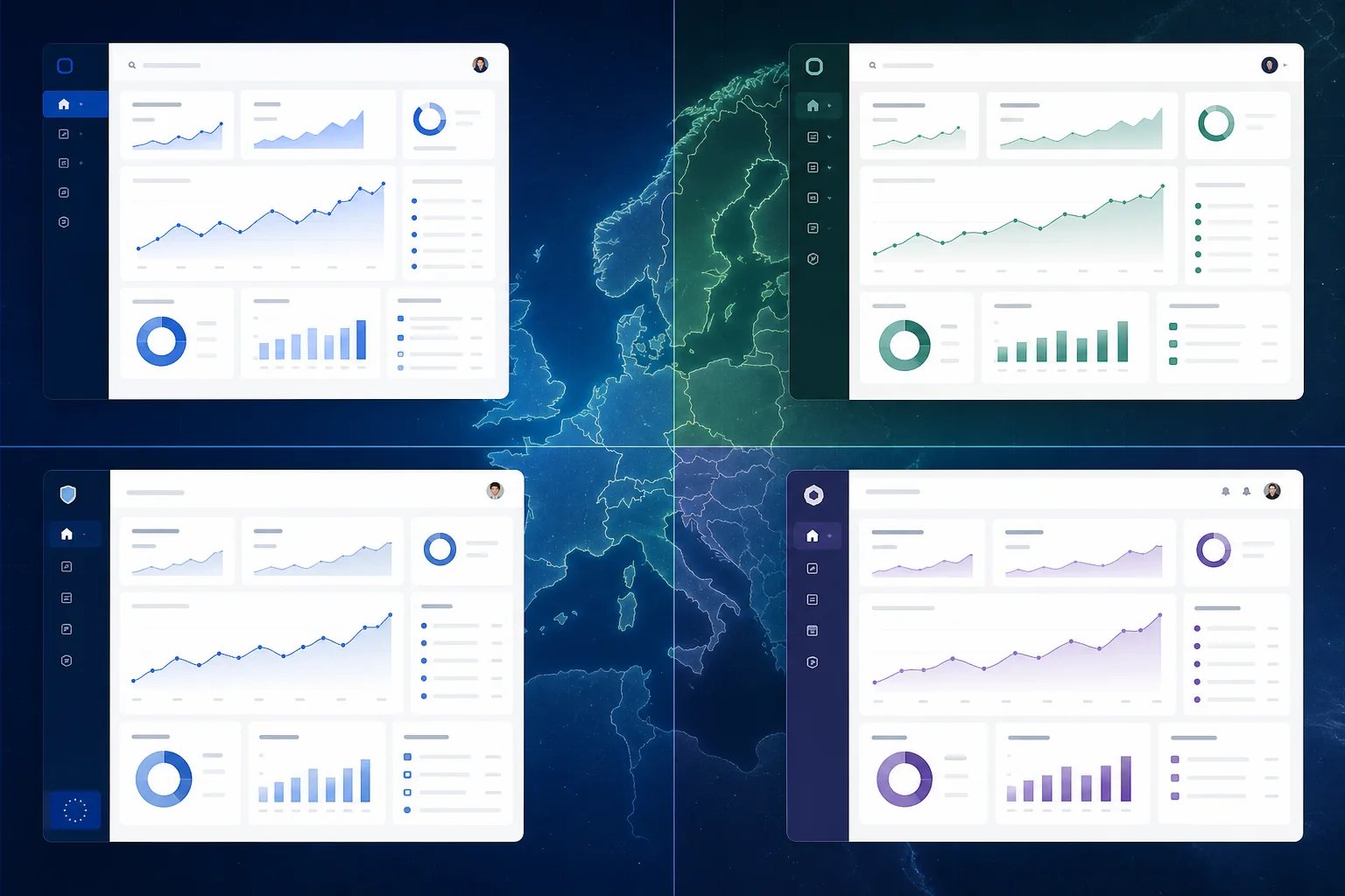
The dashboard is where most SaaS products win or lose their users in the first week. A dashboard that surfaces the right information at the right time feels like a tool built for the user's job. A dashboard that dumps every available metric onto one screen feels like homework.
Information hierarchy in B2B SaaS dashboards should be driven by job role, not by what's technically available. A sales manager needs pipeline status and conversion rates front and centre. A finance director needs spend summaries and budget variance. An operations lead needs workflow status and exception alerts. Role-based dashboard views, even if they're just default configurations the user can adjust, dramatically reduce the cognitive load of getting started.
Scannable layouts outperform data-dense ones for initial engagement. Use card-based layouts with clear visual weight to guide the eye. Reserve detailed data tables for drill-down views, not the primary dashboard. The goal of the main dashboard is to answer the question "what do I need to know right now?" in under ten seconds. If it takes longer than that, users will stop checking it.
Micro-interactions are the small, functional animations and feedback signals that tell users their actions have been registered and processed. They're easy to overlook in a product roadmap, but they have a measurable impact on user confidence and task completion rates.
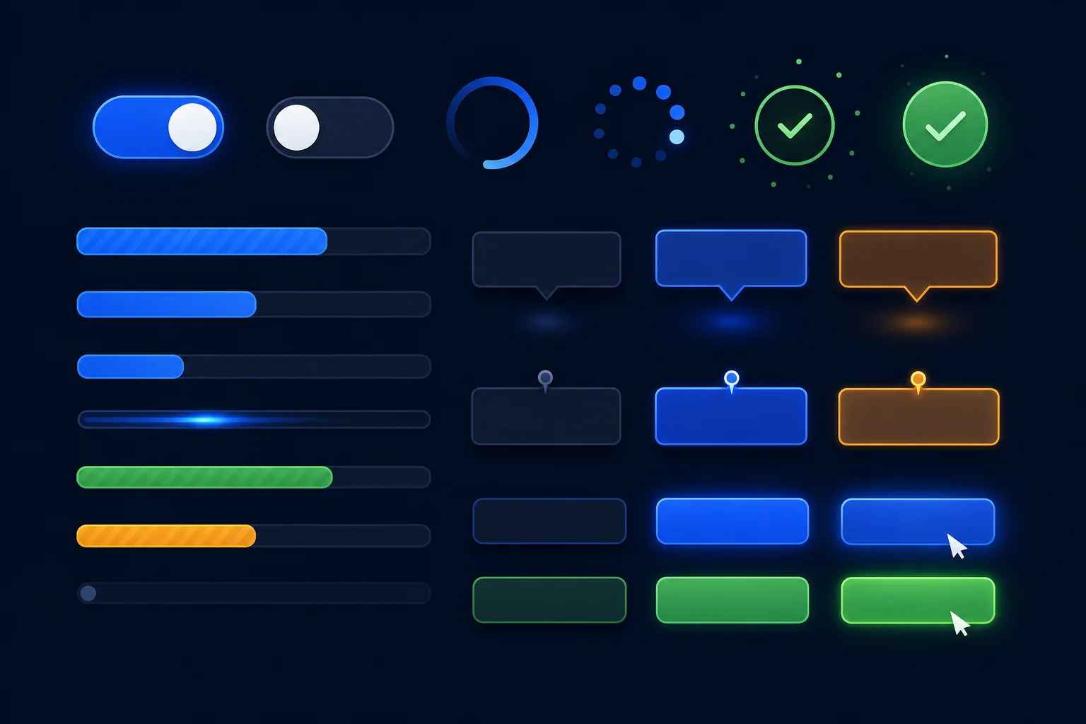
The most important micro-interactions in B2B SaaS are feedback loops: the visual confirmation that a form has been submitted, a file has been saved, a setting has been applied. Without these signals, users repeat actions, second-guess themselves, and generate support tickets asking whether something worked. A simple loading spinner with a success state eliminates that uncertainty entirely.
Inline validation on forms is another high-impact micro-interaction. Rather than showing all errors after a user submits a form, validate fields as the user completes them. This is especially important for complex B2B forms like contract setup, integration configuration, or user permission management, where a single error at the end of a long form is genuinely frustrating.
Tooltips and contextual hints reduce the need for external documentation. When a user hovers over an unfamiliar setting or metric, a well-written tooltip that explains what it does and why it matters is worth more than a help article buried three clicks away. Keep tooltips concise, specific, and written in plain language.
Localisation in SaaS UX goes well beyond translation. It includes typography choices that accommodate longer German or Dutch strings without breaking layouts, date and number formats that match regional conventions, and trust signals that resonate with specific European buyer cultures.
In the UK, users expect formal but efficient interfaces. Clarity and directness are valued over warmth. In the Netherlands and Germany, users tend to be highly detail-oriented and will read fine print that most other markets skip entirely. Nordic markets, including Sweden, Denmark, and Finland, have high digital literacy and low tolerance for unnecessary complexity. Each of these audiences will respond differently to the same interface, and the best SaaS products account for this at the design stage rather than the localisation stage.
Trust signals for European enterprise buyers include visible security certifications, clear data residency information, and transparent pricing structures. If your product stores data in EU-based servers, say so clearly in the interface. If you're ISO 27001 certified or SOC 2 compliant, surface that information during onboarding and in account settings. These details matter to procurement teams and IT departments in ways that consumer-facing products rarely need to consider.
For SaaS products serving multilingual teams, consider how your interface handles language switching. A German-speaking user in a Belgian company might need the interface in German while their colleagues use French. Building language preferences at the user level rather than the account level is a small design decision with a significant impact on adoption across multilingual organisations.
If you're building or redesigning a SaaS product for European markets, understanding how technology choices affect the user experience is equally important to the design decisions themselves.
B2B SaaS products are complex by nature. They handle multiple workflows, serve multiple roles, and accumulate features over time. Navigation design is the discipline that keeps that complexity from becoming chaos.
Sidebar navigation has become the dominant pattern for feature-rich SaaS platforms, and for good reason. It keeps the full feature set visible without requiring users to navigate away from their current context. But sidebar navigation only works well when it's organised around user tasks rather than product features. Group navigation items by what the user is trying to accomplish, not by how the engineering team structured the codebase.
Search-first design is increasingly important for power users in B2B SaaS. Users who have been using your product for six months don't want to navigate through menus to find a specific setting or record. A global search function that surfaces settings, records, and actions from a single input field dramatically improves efficiency for experienced users without adding complexity for new ones.
Breadcrumbs and clear wayfinding become critical in products with deep workflow hierarchies. If a user is three levels deep in a configuration flow, they need to know where they are, how they got there, and how to get back without losing their work. This sounds basic, but it's one of the most commonly overlooked aspects of B2B SaaS navigation design.
Consumer SaaS is designed for one person. B2B SaaS is designed for teams, and that distinction should be visible in every layer of the interface. Approval flows, shared workspaces, comment threads, and notification systems are not optional features in B2B SaaS. They are core UX infrastructure.
Permission structures need to be designed with the same care as the primary interface. When an admin sets up user roles, the interface should make it immediately clear what each role can and cannot do. When a user encounters a permission boundary, the error state should explain why they can't access something and who to contact to request access. Opaque permission errors are one of the most common sources of B2B SaaS support tickets.
Collaboration features should be designed around the actual workflow, not bolted on as an afterthought. If your product involves document review, build commenting into the document view. If it involves budget approval, build the approval action into the budget interface. Forcing users to switch to a separate communication tool to collaborate on work they're doing in your product is a significant friction point that drives users back to email.
The first time a user logs into your SaaS product, most of the data fields are empty. There are no records, no reports, no history. This "day one" experience is one of the highest-risk moments in the entire user journey, and most products handle it poorly.
Empty states are an onboarding opportunity. Instead of showing a blank table with a generic "No data yet" message, show a sample of what the interface looks like when it's populated. Explain what action the user needs to take to get there. Use the empty state to reinforce the value proposition of the feature. A well-designed empty state turns a potentially discouraging moment into a motivating one.
Error states deserve the same design attention as success states. When something goes wrong, the error message should tell the user what happened, why it happened, and what they can do about it. "Something went wrong. Please try again." is not a useful error message. "Your file couldn't be uploaded because it exceeds the 25MB limit. Try compressing the file or contact support to increase your limit." is.
B2B SaaS was historically a desktop-first category, but that's changing. European business users increasingly check dashboards, approve requests, and review reports on mobile devices, particularly in markets with high smartphone penetration like the UK, Netherlands, and Scandinavia.
The key is identifying which features genuinely need mobile-first treatment. Full data entry and complex configuration workflows are still primarily desktop tasks. But status checks, approval actions, notification responses, and quick data lookups are frequently performed on mobile. Design those specific interactions for touch-first use, with appropriately sized tap targets and simplified layouts, while keeping the full feature set accessible on desktop.
For SaaS products where mobile usage is a core part of the value proposition, a dedicated mobile app may be worth the investment. For products where mobile is supplementary, a well-executed responsive web interface is usually sufficient and significantly cheaper to maintain. Understanding the trade-offs between progressive web apps and native mobile development is an important part of this decision.
The best SaaS products teach users how to use them without requiring users to leave the product to learn. Contextual help, delivered at the moment of need, is far more effective than documentation libraries that users have to search through separately.
Walkthroughs and product tours work well for initial onboarding, but they need to be skippable and resumable. Forcing a new user through a ten-step tour before they can touch the product is a common mistake. Instead, offer the tour as an option, trigger it contextually when a user first encounters a complex feature, and make it easy to replay specific sections later.
Inline guidance, in the form of helper text beneath form fields, contextual tooltips, and "what is this?" links next to unfamiliar terms, reduces the cognitive load of learning a new product without interrupting the workflow. This is particularly important for B2B SaaS products that handle complex concepts like financial calculations, compliance workflows, or technical configurations where users may be unfamiliar with the terminology.
Notification fatigue is a real problem in B2B SaaS. When every action generates an email, every status change triggers an in-app alert, and every team member's activity produces a notification, users start ignoring everything. And when users ignore notifications, they miss the ones that actually matter.
The solution is notification design that respects user attention. Separate actionable notifications (things the user needs to do) from informational ones (things the user might want to know). Give users granular control over which notifications they receive and how. Default notification settings should be conservative, not comprehensive. It's much easier to encourage users to turn on more notifications than to recover trust after they've been overwhelmed.
In-app notifications should be designed to be acted on without leaving the current context where possible. An approval request notification that opens a side panel with the relevant details and an approve/reject action is far more effective than one that navigates the user away from what they were doing.
UX decisions that aren't connected to measurable outcomes are just opinions. The most effective SaaS design teams track a specific set of metrics that link interface decisions to business results.
Activation rate measures the percentage of new users who reach a defined "aha moment" within a set time period. This is the single most important metric for evaluating onboarding UX. If your activation rate is low, your onboarding flow is failing to connect users with the core value of your product quickly enough.
Time-to-value measures how long it takes a new user to complete their first meaningful action. In B2B SaaS, this might be creating their first report, completing their first workflow, or inviting their first team member. Reducing time-to-value is one of the highest-leverage UX improvements you can make, because it directly correlates with trial-to-paid conversion rates.
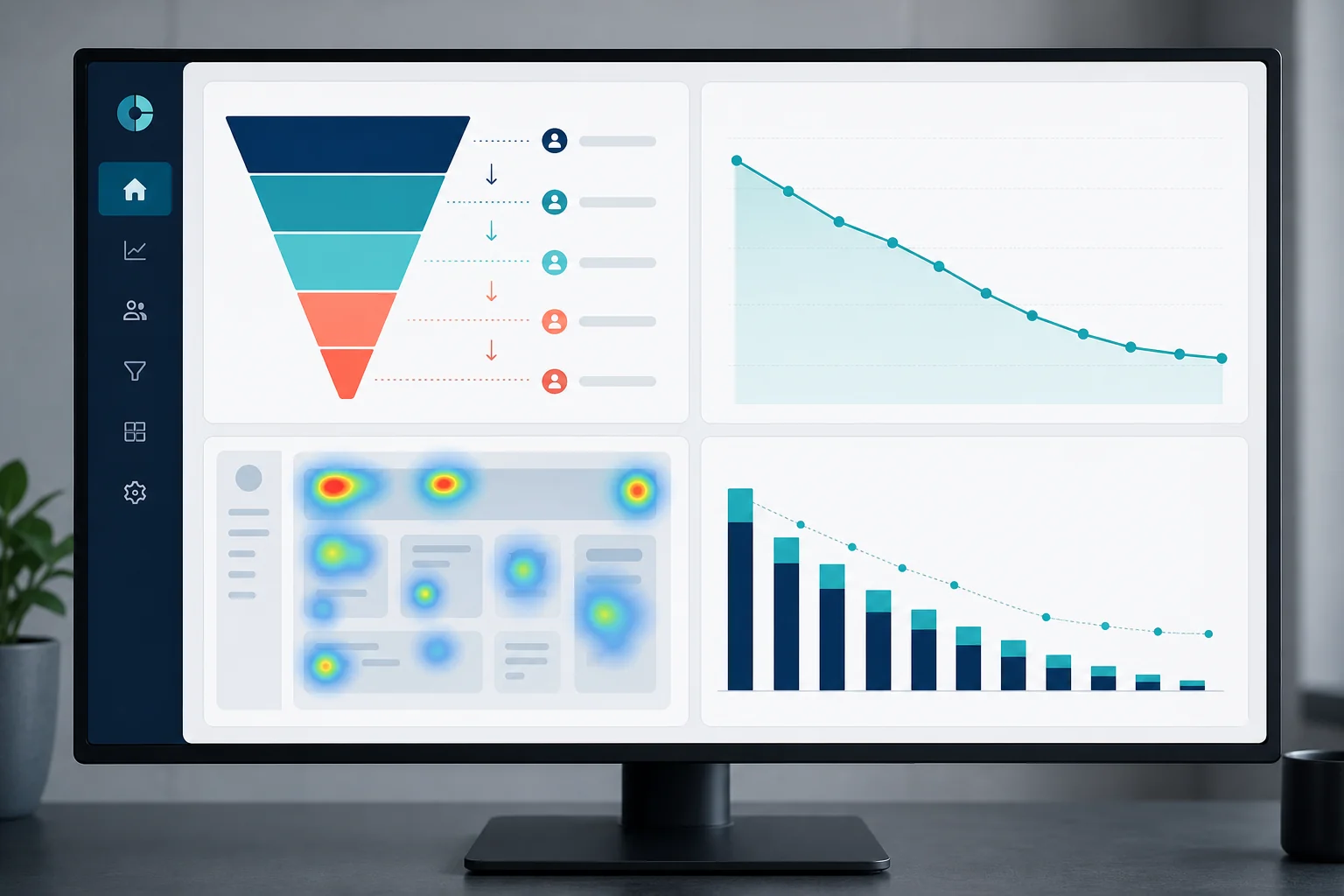
Feature adoption rates tell you which parts of your product are actually being used and which are being ignored. Low adoption of a feature you consider core to your value proposition is a strong signal that the feature is either hard to find, hard to use, or not clearly connected to a user need. Heatmaps and session recordings can help you understand exactly where users are getting stuck.
Connecting UX metrics to churn data is the final step. If users who never activate a specific feature churn at twice the rate of those who do, that feature is a retention lever. Design decisions that drive adoption of that feature are directly reducing churn. This kind of analysis transforms UX from a subjective discipline into a measurable business function. For a broader view of how design investments fit into your overall development budget, the development budget planning guide covers how to allocate funds across design, development, and ongoing iteration.
SaaS products are never finished. The design process needs to match the pace of product development, which means building a workflow that can move from insight to shipped improvement in days rather than months.
The most effective approach combines a design system with an agile iteration cycle. A design system, a library of reusable components, patterns, and guidelines, means that new features can be designed and built consistently without starting from scratch each time. It also means that design changes can be implemented across the product without inconsistencies appearing in older sections.
User testing with B2B personas in European markets doesn't require a large research budget. Moderated usability sessions with five to eight representative users will surface the majority of significant usability issues. The key is testing with the right users: actual B2B decision-makers and end users from your target markets, not internal team members who already know how the product works.
Knowing when to redesign versus when to iterate is a strategic decision that affects both budget and user experience. A full redesign is warranted when the information architecture is fundamentally broken, when the product has grown beyond the original design system's capacity, or when a major strategic pivot requires a new user experience. In most other cases, targeted iteration based on specific metric improvements is faster, cheaper, and less disruptive to existing users. Understanding the relationship between development timeline and cost helps teams make this decision with realistic expectations.
At Axire Infotech, our UX design process for SaaS products is built around the specific needs of European B2B clients. We work with startups, SMBs, and enterprises across the UK, Netherlands, Ireland, Germany, Belgium, and the Nordics, and we've developed a deep understanding of how users in these markets evaluate and adopt digital products.
Our process starts with discovery: understanding your users, their workflows, and the specific outcomes your product needs to deliver. From there, we move through wireframes to high-fidelity prototypes, testing at each stage with representative users before a single line of code is written. This approach reduces expensive rework during development and ensures that the product we build is one your users will actually adopt.
We integrate UX design directly with our development teams, which means design decisions are made with technical feasibility in mind from the start. There's no handoff gap where designs get simplified or compromised during implementation. What you see in the prototype is what gets built.
If you're building a new SaaS product or redesigning an existing one for European B2B markets, explore our UI/UX design services to see how we approach the process. You can also review our project portfolio to see examples of SaaS and web application design work we've delivered for European clients.
For teams evaluating the full scope of a SaaS build, our web development services and app development services work in close coordination with the UX design process to deliver complete, production-ready products. You can also view all our services to understand the full scope of what we offer.
It's also worth understanding how UX design decisions interact with your technology choices. Our guide on custom software development for European markets covers how to align design, technology, and business goals from the start of a project.
For a new SaaS product, a thorough UX design process from discovery through high-fidelity prototypes typically takes six to twelve weeks, depending on product complexity and the number of user roles involved. Iterative improvements to an existing product can be scoped and delivered in two to four week sprints. The timeline is directly affected by how clearly the product requirements are defined at the start. A well-defined scope reduces design time significantly.
UX design (user experience) covers the structure, flow, and logic of how a product works: information architecture, user journeys, onboarding flows, and interaction patterns. UI design (user interface) covers the visual execution: colour, typography, component styling, and visual hierarchy. In SaaS products, both disciplines are essential and deeply interconnected. A beautiful UI built on a poorly structured UX will still frustrate users. A well-structured UX with weak visual design will undermine trust. The most effective SaaS design processes treat them as a single integrated discipline.
The cost of UX design for a SaaS product varies significantly based on scope, complexity, and the experience level of the team involved. A focused UX audit of an existing product is a different investment from a full design process for a new platform. The most reliable way to get an accurate estimate is to define your project scope clearly before requesting quotes. Our guide to defining project scope walks through the nine elements that most affect design and development cost.
UX design should lead development, not run alongside it. When design and development happen simultaneously, developers make interface decisions by default, and those decisions are much harder to change once code is written. A completed, tested UX design before development begins reduces rework, speeds up development, and produces a better end product. In agile projects, design typically runs one sprint ahead of development, ensuring that developers always have a validated design to build from.
If your core user flows are fundamentally broken, your information architecture no longer reflects how users think about your product, or your design system has become inconsistent across the product, a redesign is likely warranted. If specific features have low adoption, specific flows have high drop-off, or specific user segments are churning at higher rates, targeted iteration is usually faster and more effective. Start with data: identify the specific points where users are failing, and design solutions to those specific problems before committing to a full redesign.
The SaaS products that win in European B2B markets aren't the ones with the most features. They're the ones that make complex workflows feel simple, build trust through clarity, and deliver value before asking for commitment. That's what great UX design for SaaS actually delivers.
If you're ready to build or redesign a SaaS product with UX that drives real activation and retention results in European B2B markets, get in touch with the Axire Infotech team. We'll start with a discovery conversation about your users, your product goals, and the specific design challenges you're facing, and give you a clear picture of what a well-executed UX design process looks like for your specific context. You can also explore more articles on digital product design, development, and strategy for European markets.
Let's discuss your project and create something amazing together.