If your business operates in Sweden, accessibility is no longer optional. Whether you're launching a new product, redesigning an existing platform, or building a mobile app, UI/UX Sweden projects must meet strict accessibility standards to comply with Swedish and EU law. More importantly, accessible design is simply better design. It creates faster, clearer, and more inclusive digital experiences that benefit every user, not just those with disabilities.
This guide covers everything you need to know about WCAG 2.2 compliance for the Swedish market in 2026. From legal obligations and color contrast rules to screen reader optimization and testing protocols, you'll walk away with a clear, actionable roadmap for building accessible digital products in Sweden.

Sweden has one of the most digitally advanced populations in Europe. According to Internetstiftelsen (The Swedish Internet Foundation), over 95% of Swedes use the internet regularly. With such high digital adoption, the expectations for quality, performance, and inclusivity are equally high. Swedish users expect digital products to work seamlessly for everyone, including the approximately 20% of the population living with some form of disability.
For businesses building UI/UX Sweden products, accessibility compliance is driven by three forces: legal obligation, user experience quality, and competitive advantage. Ignoring accessibility means risking legal penalties, alienating a significant portion of your audience, and falling behind competitors who have already made inclusion a core part of their design strategy.
WCAG 2.2 (Web Content Accessibility Guidelines) is the international standard that defines how digital interfaces should be built to serve users with visual, auditory, motor, and cognitive disabilities. In Sweden, these guidelines are embedded into national law and EU directives, making compliance a legal requirement for most digital products.
Beyond compliance, accessible design delivers measurable business results. Accessible websites load faster, rank better in search engines, and convert more users. When your UI/UX Sweden project is built with accessibility in mind from day one, you avoid costly retrofits later. Studies from the W3C Web Accessibility Initiative consistently show that accessible design improves overall usability for all users, not just those with disabilities.
Understanding the legal landscape is the first step for any UI/UX Sweden project. Sweden has implemented several overlapping regulations that govern digital accessibility, and non-compliance carries real consequences.
The EU Web Accessibility Directive (WAD) was transposed into Swedish law as DOS-lagen (Lagen om tillgänglighet till digital offentlig service). This law requires all public sector bodies in Sweden to meet WCAG 2.1 Level AA as a minimum, with WCAG 2.2 now being the recommended standard. Public sector organizations must also publish an accessibility statement and provide a feedback mechanism for users who encounter barriers.
Enforcement is handled by DIGG (Myndigheten för digital förvaltning, the Agency for Digital Government). DIGG conducts audits, receives complaints, and can require organizations to remediate non-compliant digital services. For public sector bodies, this is not a soft recommendation. It is a legal obligation with formal oversight.
The European Accessibility Act (EAA) came into full effect in June 2025, extending accessibility requirements to the private sector across the EU, including Sweden. This is a significant shift. Previously, private businesses had more flexibility. Now, companies offering products and services in Sweden, including e-commerce platforms, banking apps, transport services, and consumer electronics, must meet EN 301 549 accessibility standards, which are directly aligned with WCAG 2.2.
If your business sells to Swedish consumers online, the EAA almost certainly applies to you. The penalties for non-compliance vary by member state, but Swedish enforcement authorities have the power to issue fines and require corrective action. For businesses building UI/UX Sweden products, getting ahead of these requirements now is far less expensive than remediation after an audit or complaint.
WCAG 2.2 is organized around four core principles, known as the POUR framework. Every success criterion in the guidelines maps back to one of these four principles. Understanding them is essential for any team working on UI/UX Sweden projects.
Information and interface components must be presentable to users in ways they can perceive. This means providing text alternatives for non-text content, captions for video, and ensuring that content doesn't rely solely on color to convey meaning. For Swedish interfaces, this also means considering multilingual users and ensuring that translated content maintains the same accessibility properties as the original.
All interface components and navigation must be operable. Users must be able to navigate your product using a keyboard alone, without a mouse. Animations and moving content must not cause seizures. Users must have enough time to read and interact with content. These requirements are especially important for UI/UX Sweden projects targeting older demographics or users with motor disabilities.
Information and the operation of the interface must be understandable. This covers readable text, predictable navigation patterns, and helpful error messages. For Swedish-language interfaces, plain language is critical. Sweden has a strong tradition of plain language communication (klarspråk), which aligns naturally with WCAG's understandability requirements.
Content must be robust enough to be interpreted reliably by a wide variety of user agents, including assistive technologies. This means writing clean, semantic HTML, using ARIA roles correctly, and testing with actual screen readers and assistive devices. A visually polished interface that breaks with a screen reader fails the robust principle entirely.
Color contrast is one of the most commonly failed accessibility criteria in UI/UX Sweden projects. WCAG 2.2 defines specific contrast ratios that text must meet against its background to be readable by users with low vision or color blindness.
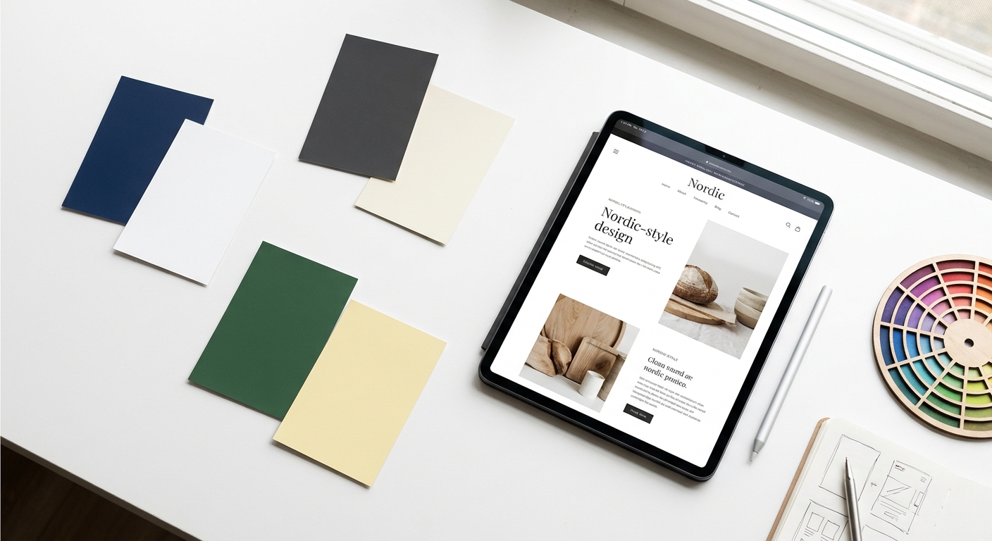
The good news for Swedish designers is that the Nordic design aesthetic, characterized by clean layouts, generous white space, and restrained color palettes, naturally lends itself to high contrast. Deep navy blues, charcoal grays, and forest greens against white or light cream backgrounds are both on-trend and accessible. The challenge arises when brands use light gray text on white backgrounds or low-saturation color combinations that look elegant but fail contrast checks.
Dark mode is increasingly popular among Swedish users, particularly in mobile apps. If your UI/UX Sweden product supports both light and dark themes, both must meet contrast requirements independently. A color that passes in light mode may fail in dark mode if the background shift isn't accounted for. Always test both themes with tools like the Colour Contrast Analyser or WebAIM's Contrast Checker before shipping.
Beyond contrast, typography choices significantly affect accessibility. Use a minimum body font size of 16px for web interfaces. Ensure line height is at least 1.5 times the font size. Avoid justified text alignment, which creates uneven spacing that makes reading harder for users with dyslexia. These are small decisions that have a large impact on the overall quality of your UI/UX Sweden design.
Keyboard accessibility is a foundational requirement for any UI/UX Sweden project. Many users with motor disabilities, repetitive strain injuries, or visual impairments rely entirely on keyboard navigation. If your interface can't be used without a mouse, it fails a significant portion of your potential users and violates WCAG 2.2 Success Criterion 2.1.1.
Every interactive element on your page, including links, buttons, form fields, and custom components, must be reachable via the Tab key. The tab order should follow a logical reading sequence, typically left to right and top to bottom. Focus indicators (the visible outline that shows which element is currently selected) must be clearly visible. WCAG 2.2 introduced a new success criterion (2.4.11) requiring that focus indicators have a minimum area and contrast ratio, making this more specific than previous versions.
A common mistake in UI/UX Sweden projects is removing focus outlines with outline: none in CSS for aesthetic reasons. This makes the interface completely unusable for keyboard users. Instead, design custom focus styles that match your brand while meeting contrast requirements.
For pages with repeated navigation blocks, provide a "skip to main content" link at the top of the page. This allows keyboard users to bypass navigation menus and jump directly to the page content. Use HTML5 landmark elements (<header>, <nav>, <main>, <footer>) to define page regions that screen reader users can navigate between quickly.
Modal dialogs, dropdown menus, date pickers, and carousels require careful keyboard management. When a modal opens, focus must move into it. When it closes, focus must return to the triggering element. Dropdowns must be navigable with arrow keys. These interaction patterns are defined in the ARIA Authoring Practices Guide and should be followed precisely in every UI/UX Sweden component library.
Screen readers convert digital text and interface elements into speech or Braille output. In Sweden, the most commonly used screen readers include NVDA and JAWS on Windows, VoiceOver on Apple devices, and TalkBack on Android. Each has slightly different behavior, which is why testing across multiple screen readers is essential for any UI/UX Sweden project.
The foundation of screen reader accessibility is semantic HTML. Use heading tags (<h1> through <h6>) to create a logical document outline. Use lists (<ul>, <ol>) for grouped items. Use <button> for interactive controls and <a> for navigation links. Avoid using <div> and <span> for interactive elements without adding appropriate ARIA roles and keyboard handlers.
When native HTML semantics aren't sufficient, ARIA (Accessible Rich Internet Applications) attributes fill the gap. Use aria-label to provide descriptive names for elements that lack visible text labels. Use aria-describedby to associate help text or error messages with form fields. Use role attributes to define the purpose of custom components. However, follow the first rule of ARIA: don't use ARIA if a native HTML element can do the job.
Every meaningful image must have descriptive alt text that conveys the same information the image provides visually. Decorative images should have empty alt attributes (alt="") so screen readers skip them. All form inputs must have associated <label> elements. Error messages must be programmatically associated with the field that caused the error, not just visually positioned nearby. For Swedish-language interfaces, ensure alt text and labels are written in the same language as the surrounding content.
Building accessible UI/UX Sweden products requires a structured testing approach that combines automated tools, manual review, and real user testing. No single method catches everything. A comprehensive testing protocol uses all three layers.
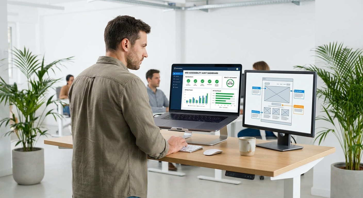
Automated tools can catch approximately 30-40% of accessibility issues quickly and consistently. The most widely used tools for UI/UX Sweden projects include:
Integrate automated accessibility checks into your CI/CD pipeline so that regressions are caught before they reach production. This is a standard practice at Axire Infotech for all UI/UX Sweden and European market projects.
Manual testing catches issues that automated tools miss, particularly around context, logic, and user experience quality. Key manual checks for every UI/UX Sweden project include:
The most valuable accessibility testing involves real users with disabilities. Recruit participants who use screen readers, switch access devices, or have cognitive disabilities to test your UI/UX Sweden product. Their feedback will surface usability issues that no automated tool or checklist can predict. In Sweden, organizations like HRF (Hörselskadades Riksförbund) can be valuable partners for recruiting testers with hearing impairments.
For enterprise clients and public sector organizations, a formal accessibility audit with a VPAT (Voluntary Product Accessibility Template) or ACR (Accessibility Conformance Report) is often required. This document maps your product's features against each WCAG success criterion and declares the level of conformance. It is a standard deliverable for procurement processes in Swedish public sector contracts.
Accessibility and SEO share a common foundation: both require clean, semantic, well-structured content that communicates meaning clearly. When you invest in UI/UX Sweden accessibility, you simultaneously improve your search engine rankings and overall business performance.

Search engine crawlers, like screen readers, rely on semantic HTML to understand page structure and content hierarchy. Proper heading tags, descriptive link text, image alt attributes, and structured data all help Google understand what your page is about. These are the same elements required for WCAG compliance. A well-structured UI/UX Sweden project that passes accessibility audits will almost always perform better in organic search than one that doesn't.
Google's Core Web Vitals (LCP, CLS, INP) measure user experience quality and directly influence search rankings. Many accessibility best practices, such as avoiding layout shifts, optimizing images with proper dimensions, and minimizing render-blocking resources, also improve Core Web Vitals scores. For Swedish businesses competing in local search, this connection between accessibility and page performance is a significant advantage.
Approximately 1 in 5 people in Sweden lives with a disability. That's a substantial portion of your potential customer base. When your UI/UX Sweden product is accessible, you're not just complying with the law. You're opening your product to a wider audience, including older users who benefit from larger text and simpler navigation, users in challenging environments (bright sunlight, noisy spaces), and users on older or lower-powered devices.
In the Nordic market, where corporate social responsibility and ethical business practices are highly valued, accessibility is increasingly a differentiator. Swedish B2B buyers and procurement teams actively evaluate accessibility compliance when selecting digital vendors. Businesses that can demonstrate WCAG 2.2 compliance and a genuine commitment to inclusive design win contracts that less-prepared competitors lose.
At Axire Infotech, accessibility is built into every UI/UX Sweden project from the wireframe stage. Our design and development teams follow WCAG 2.2 guidelines as a baseline, not an afterthought. Whether you're building a new web application, redesigning an existing platform, or developing a mobile app for the Swedish market, we ensure your product meets legal requirements while delivering an exceptional experience for every user. Explore our UI/UX design services or our web development services to see how we approach accessible design for European markets.
For teams also building mobile products, our app development services follow the same accessibility-first approach for both iOS and Android platforms. You can also view our project portfolio to see examples of accessible digital products we've delivered for clients across Sweden, the United Kingdom, and the Netherlands.
If you're planning a new project or want to understand the full scope of what's involved, our Complete Guide to Web Development in Sweden 2026 covers the broader technical landscape, and our App Development Cost Guide helps you plan your budget with confidence.
For public sector organizations, WCAG 2.1 Level AA is the legal minimum under DOS-lagen, but WCAG 2.2 Level AA is now the recommended standard. For private sector businesses covered by the European Accessibility Act (effective June 2025), EN 301 549 compliance is required, which aligns with WCAG 2.2. For most UI/UX Sweden projects, targeting WCAG 2.2 Level AA is the right baseline.
The EAA applies to businesses that offer products or services to consumers in EU member states, including Sweden. It covers e-commerce websites, banking and financial services, transport services, e-books, and consumer electronics. Micro-enterprises (fewer than 10 employees and annual turnover under €2 million) are exempt from some provisions, but it's worth reviewing your specific situation with a legal advisor familiar with Swedish implementation.
A basic automated audit can be completed in hours. A comprehensive manual audit of a medium-sized website or application typically takes 3 to 5 business days. A full audit including user testing with people with disabilities can take 2 to 4 weeks. For ongoing UI/UX Sweden projects, integrating accessibility testing into your development sprint cycle is more efficient than periodic large audits.
Absolutely. Accessibility constraints, particularly around contrast, typography, and clear navigation, often push designs toward greater clarity and elegance. The Nordic design tradition of minimalism and purposeful simplicity is highly compatible with WCAG requirements. Many of the most visually striking Swedish digital products are also among the most accessible. Accessibility and aesthetics are not in conflict. They reinforce each other.
The cost depends on the current state of your product and the scope of remediation needed. Building accessibility in from the start is significantly less expensive than retrofitting an existing product. For new UI/UX Sweden projects, accessibility adds minimal cost when it's part of the design and development process from day one. For existing products, a phased remediation approach prioritizing the most critical issues first is typically the most cost-effective path. Contact us for a tailored assessment of your specific situation.
Accessibility is not a checkbox. It's a design philosophy that makes digital products better for everyone. For businesses operating in Sweden, meeting UI/UX Sweden accessibility standards is both a legal requirement and a strategic advantage. WCAG 2.2 compliance, combined with thoughtful inclusive design, positions your product to serve the widest possible audience, rank better in search, and build lasting trust with Swedish users.
Whether you're starting a new project or improving an existing one, the time to address accessibility is now. The European Accessibility Act is in full effect, DIGG enforcement is active, and Swedish users expect digital products that work for everyone. Don't let accessibility debt slow your growth or expose your business to legal risk.
Axire Infotech specializes in building accessible, high-performance digital products for the Swedish and broader European market. From UI/UX Sweden design and WCAG audits to full-stack web and mobile development, our team brings the technical expertise and Nordic market knowledge your project needs. View all our services or contact our team today to discuss your accessibility requirements and transform your digital presence into one that truly works for every user in Sweden.
This blog post was written using thestacc.com
Let's discuss your project and create something amazing together.