
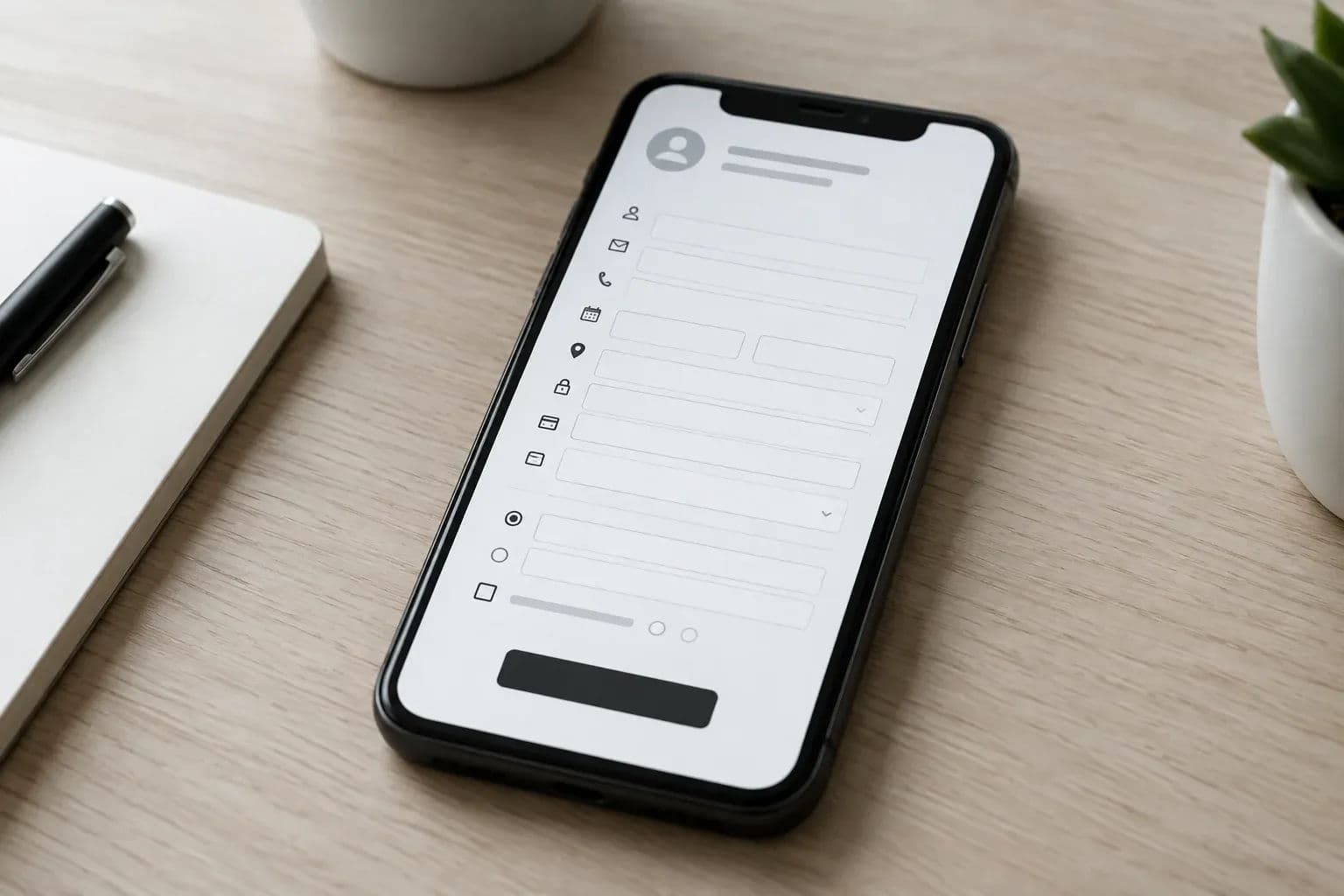
Mobile app UI mistakes that make users uninstall, from cluttered onboarding to inconsistent navigation, each paired with a practical fix. See how to avoid them.
Mobile app UI is everything a person sees and touches in an app: onboarding and sign-up screens, navigation bars and back controls, permission dialogs, buttons and forms, and the loading, error and empty screens. Users delete a mobile app when that interface makes them work before it gives them anything back.
The most common mobile app UI mistakes are a sign-up wall before any value, inconsistent navigation, early permission requests, slow or silent screens, overloaded layouts and tiny tap targets. Each one has a fix you can build and test before launch.
Key takeaways
- Show value first: let people try the core action before asking for an account, a profile or a tutorial run-through.
- One navigation model: pick a single structure, keep the back action predictable, and respect each platform's habits where they differ.
- Ask at the right moment: request camera, location or notification access only when the user taps something that needs it.
- Design every state: loading, empty, error and offline screens are part of the interface, not extras for later.
- Shared code helps consistency: one React Native codebase for iOS and Android means one set of components and one navigation setup to review, though it does not replace design judgement.
Mobile app UI mistakes at a glance
| Mistake | What the user feels | Fix | Catch it in |
|---|---|---|---|
| Cluttered onboarding | "I have not seen what this does yet" | Let people try the core action first; ask for details later | Prototype |
| Inconsistent navigation | "Where am I, and how do I go back?" | One navigation model with platform-aware back behaviour | Design and build |
| Early permission prompts | "Why does it need this?" | Ask in context, with a short explanation first | Design |
| Slow or silent screens | "Is it frozen?" | Loading, error and offline states on every screen | Build and testing |
| Overloaded screens | "Too much going on" | One primary action per screen; cut rarely used features | Scoping |
| Small tap targets and weak contrast | "I keep hitting the wrong thing" | Larger targets, readable contrast, scalable text | Design and testing |
Worked example: fixing a sign-up wall in a prototype
Suppose a booking app opens on a registration form with five fields and a ten-screen tour. Before: a tester must finish the form before seeing any available slots, and asks what the app is for. After: the first screen shows available slots as a guest, the tour becomes one hint on the slot list, and the account request appears only when the user taps "Book".
Name, phone and photo move to later moments. We would judge it by the pass mark below: a new user reaches the first valuable action in about a minute. This is an illustrative scenario, not a client result, and we do not quote measured drop-off figures here.
Why do users delete an app after a bad interface?
Users delete an app when the interface costs them more effort than the app seems worth. They decide within the first few sessions. A confusing first screen, a login wall or a slow response tells them the product is not worth the storage space, however good the idea behind it is.
For a founder, this changes where the budget should go. Most early uninstalls are not caused by a missing feature. They come from friction in the screens people see in the first minute. Academic work backs up how much the interface matters: a Monash University study of Google Play reviews describes the user interface as an essential factor in how users perceive an app.
The mistakes below are the ones we see most often when startups bring us a product to plan or repair. Each comes with the fix a React Native team would apply, and a pass mark so you can tell whether the fix worked.
1. Cluttered onboarding that asks too much before showing value
Onboarding fails when the app asks for an email, a password, a phone number, a profile photo and a tour of ten features before the user has done anything useful. Every extra field is a reason to leave. The user has no proof yet that the app is worth the effort.
What the mistake looks like
- A registration wall on first launch, before any content or demo.
- A multi-screen feature tour that users swipe through without reading.
- Long forms that collect data the team does not need on day one.
- Several permission prompts stacked on the first screen.
The fix we would apply
Start with the user's goal, not your data needs. Let them reach the core action as a guest where the product allows it, and ask for an account at the moment it becomes useful, such as saving, paying or syncing across devices.
- Name the first valuable action. For a booking app it is seeing available slots. For a note app it is writing a note. Everything before it is a candidate for removal.
- Cut the tour to what the first action needs. Replace a long carousel with one or two short hints shown on the screen where they apply.
- Collect profile data progressively. Ask for a name when you greet someone, a phone number when you need to send a reminder.
- Always allow skipping for anything that is not required to complete the first action.
Pass mark: a new user, with no briefing, reaches the first valuable action in about a minute and without reading instructions. Walk-away sign: testers stall on a form, or ask what the app is for after finishing onboarding. If that happens, remove a step and test again before writing more code.
2. Inconsistent navigation across screens and platforms
Navigation breaks when the same gesture or button does different things on different screens, or when the app ignores how each platform handles going back. Users stop trusting the app because they cannot predict what a tap will do.
Platforms differ on this point. Older Android design documentation, hosted by MIT, notes that Android uses the navigation bar's back button for temporal navigation, while iOS apps rely on an explicit back control inside the screen. Current Android guidance also says you usually should not add your own back button. An app that copies one platform's pattern onto the other feels off to half its users.
Common navigation errors
- A bottom tab bar on some screens and a hamburger menu on others.
- Back behaviour that sometimes closes the app and sometimes goes up one level.
- Five or more top-level destinations crammed into one tab bar.
- Deep links that open a screen with no sensible way back.
- Different names for the same section on different screens.
The fix we would apply
Draw the whole navigation map before any screen is designed. Decide the top-level destinations (a tab bar suits a handful of equal sections), and give every other screen a clear parent. Then define what back does in each case and write it down.
In React Native, a single navigation library configuration holds the structure for both platforms. The Android hardware and gesture back action is handled through the framework's BackHandler API, so back can follow platform rules without forking the app. Deep links should be tested so that the back stack makes sense when someone lands on a screen from outside the app.
Pass mark: a tester can say where they are and how to return from any screen without guessing, on both an iPhone and an Android phone. Walk-away sign: the same person taps back and ends up somewhere they did not expect, even once.
3. Asking for permissions too early
A permission prompt on first launch asks for trust the app has not earned. Users who tap "Don't allow" often have to dig into system settings to reverse it, and many never do. The feature then stays broken, and the app looks faulty.
The fix we would apply
Ask when the user taps something that needs the permission. A "Scan a code" button can trigger the camera request. A "Find near me" button can trigger location. Before the system prompt, show one short line explaining the benefit in plain words.
Plan the refusal path too. If the user says no, the screen should still work in a reduced way and explain how to enable access later. Notifications deserve the same care: ask after the user has seen a reason to hear from you, not before.
Pass mark: no system prompt appears before the user has done something that clearly needs it, and every "no" leads to a usable screen. Walk-away sign: any prompt on the very first screen.
4. Slow, unstable screens and no offline state
A blank screen with no feedback reads as a crash. Users cannot tell whether the app is loading, broken or waiting for a connection, so they close it. The interface needs to explain what is happening at every moment, including when things go wrong.
The fix we would apply
- Loading states: skeleton layouts that show the shape of the content while data arrives, instead of an empty page.
- Error states: a plain sentence saying what failed and a single button to retry.
- Offline states: keep already loaded content readable and queue simple actions until the connection returns, where the product allows it.
- Empty states: a first-time screen with nothing in it should say what will appear here and offer the action that fills it.
Speed is part of the interface too. Heavy images, chatty network calls and unoptimised lists make good screens feel bad. The same diagnosis steps apply as for the web, and our post on diagnosing a slow website covers the method.
Pass mark: with airplane mode switched on halfway through a task, the app tells the user what happened and how to continue. Walk-away sign: a spinner that never ends, or a blank white screen.
5. Overloaded screens and too many features
Founders often fear that a simple screen looks unfinished, so they add one more button, one more banner, one more setting. The result is a screen with five competing actions. Users freeze, and then leave.
Apple's mobile design guidance puts the rule plainly: focus on the needs of 80 percent of your users, and leave out functionality that only a few users want, or that most want only once. That is an older edition of the guidelines, but the principle has not aged.
The fix we would apply
- Give each screen one primary action and make it the most visible element.
- Move rarely used options into a settings area or a secondary menu.
- Cut features that serve a small group before launch. You can add them once usage data shows demand.
- Keep the vocabulary consistent, so the same thing has the same name everywhere.
Cutting features is a scoping decision as much as a design one. Our guide to MVP feature prioritisation shows how to decide what goes in the first release.
Pass mark: a tester can point to the main action on every screen within a couple of seconds. Walk-away sign: they hesitate between two or three equal-looking choices.
6. Ignoring accessibility, tap targets and readability
Small buttons, pale grey text on white and fixed font sizes make an app hard to use for everyone, not only for people with disabilities. Bright sunlight, a moving train and one-handed use all expose the same weaknesses.
The fix we would apply
- Make tap targets large enough for a thumb, with space between neighbouring buttons.
- Check text contrast against the accessibility guidelines for your market, and do not rely on colour alone to show errors or status.
- Support the system text size setting so that larger text does not break layouts.
- Label icons and buttons so screen readers can announce them.
For apps sold into the EU, accessibility is also becoming a compliance matter. Our WCAG compliance guide for Nordic markets explains what to check.
Pass mark: the key flows work with large system text and with a screen reader switched on. Walk-away sign: text is cut off, or a button cannot be reached or announced.
How does one React Native codebase keep iOS and Android consistent?
One React Native codebase keeps iOS and Android consistent because both apps are built from the same components, the same navigation setup and the same design tokens. A change to a button or a screen is made once and appears on both platforms, so the two versions cannot quietly drift apart.
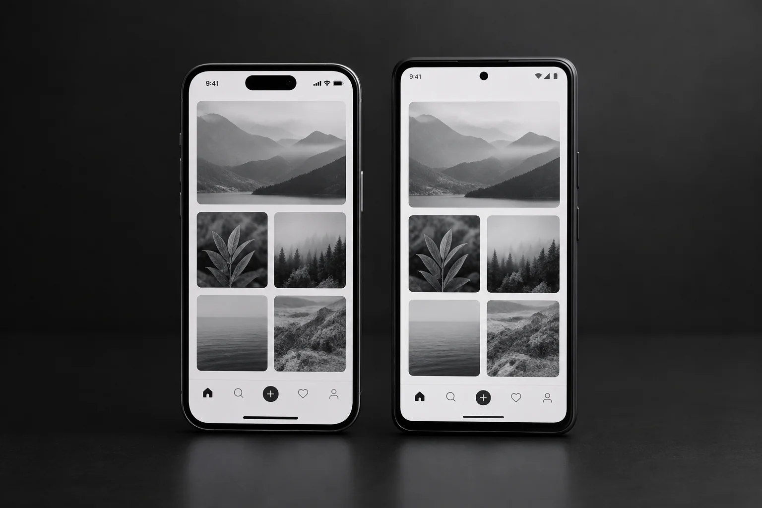
This is the build-side view we bring to the interface problems above. React Native describes itself as written in JavaScript but rendered with native code, so the app uses the platform's own native UI elements. With two separate native teams, a navigation fix on iOS has to be remembered and rebuilt on Android. With one codebase, it is one change and one review.
What gets shared
- Design tokens: colours, spacing and type sizes defined once.
- Components: buttons, inputs, cards and list rows built once and reused.
- Navigation structure: one map of screens, tabs and parents.
- State screens: loading, empty, error and offline views reused across features.
Where platforms should still differ
Consistency does not mean identical. Back behaviour, system dialogs, date pickers and share sheets should follow each platform's conventions, because that is what users already know. A good React Native build shares the structure and lets the platform handle these details.
It is also fair to say one codebase is not the answer to everything. Apps that depend on heavy custom graphics, unusual hardware access or very platform-specific features may need native modules or separate code. We cover that trade-off in our explainer on cross-platform app development. Whether a given product crosses that line is something we judge during discovery, not before.
What fixes does Axire apply during design and prototyping?
Axire fixes interface problems during design and prototyping, before development starts. We build wireframes, mockups and interactive prototypes, walk through them against a checklist of the mistakes above, and change the design while a change costs a few hours of design time rather than a rebuild of finished screens.
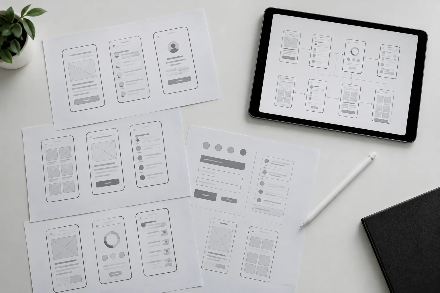
Our project process has four steps: discovery and planning, design and prototyping, development and testing, then launch and support. The interface work sits mostly in the second step, with checks repeated in the third.
Discovery and planning
We start with the business goal, the target user and the one action the app must make easy. That answer decides the first screen, the onboarding length and the top-level navigation. Features that do not serve it are listed for later.
Design and prototyping
Our design team works in Figma and Adobe Creative tools. Wireframes settle the screen flow, then mockups add the visual layer, then clickable prototypes let you and your test users tap through the journey on a real phone. Navigation, onboarding length and permission timing get tested here, when changes are cheap.
Development and testing
The developers build the shared component library first, then the screens. We test on real iOS and Android devices, and we review loading, error and offline states as deliberately as the happy path. Our UI/UX design service and our app development service work as one team, so the designer who drew a screen is available when a developer has a question about it.
Launch and support
After release, real usage data tells you which screens lose people. We help you read it and fix what it shows. Before release, our mobile app launch checklist covers the wider readiness steps beyond the interface.
A pre-launch mobile app UI audit you can run this week
You can audit your own app in an afternoon with five people who have never seen it. Give each a phone, give them a task, stay silent and write down where they hesitate. Use the checks below, and treat a fail as a fix to schedule, not a note to file.
| Check | Pass | Fail: do this |
|---|---|---|
| First action | Reached in about a minute with no help | Remove onboarding steps and retest |
| Sign-up timing | Account requested only when it gives something back | Add a guest path or move sign-up later |
| Navigation | Testers can say where they are and how to go back | Redraw the navigation map and fix back behaviour |
| Permissions | Asked in context; refusal still leaves a working screen | Move the prompt and build the refusal path |
| Loading and errors | Every wait and failure explains itself | Add skeleton, error and retry states |
| Offline | Airplane mode mid-task gives a clear message | Add offline handling for the main flow |
| Screen focus | One main action is obvious on each screen | Demote or remove competing elements |
| Accessibility | Large text and screen reader still work for key flows | Fix layouts, labels and contrast |
Run the audit on both platforms, since a fix that works on an iPhone can fail on an Android device. If you are weighing how much of this work to put in a first release, our overview of services shows how design, build and strategy fit together.
One thing remains open: five testers will find the loudest problems, not every problem. After launch, real analytics are the only way to learn which screens actually lose people, so plan for that data from the start.
FAQ: mobile app UI questions founders ask
How many onboarding screens should a mobile app have?
As few as the first valuable action requires, often none beyond a short welcome. If the app truly needs an introduction, keep it to two or three short screens with a skip option. Hints shown on the screen where they apply usually work better than a carousel shown before use.
Should I ask users to sign up before they see the app?
Only when the product cannot work without an account, such as banking or private messaging. For most apps, let people try the core action first and ask for an account when saving, paying or syncing. A sign-up wall before value is one of the quickest ways to lose a new user.
Does a React Native app look and feel native?
Yes, when it is built with care. React Native renders to the platform's own native UI elements, so buttons, inputs and scrolling behave as users expect. The look and feel then depend on design choices, such as following each platform's back behaviour and dialog conventions where they differ.
Which interface problem should I fix first?
Fix the first minute: onboarding, sign-up timing and permissions. These screens decide whether anyone sees the rest of your app. After that, fix navigation and the loading, error and offline states, then tidy overloaded screens and accessibility with real usage data to guide you.
Can I fix these problems after launch?
You can, but it costs more. Changing a prototype takes hours, while changing built and released screens means rework, testing and a new store release. Users who delete the app also rarely come back. Catching navigation and onboarding problems in prototypes is the cheaper route.
Fix your app's interface before users uninstall it
Most uninstalls trace back to a handful of avoidable interface mistakes, and most of them are cheapest to fix on a prototype. If you are planning a product or repairing one, we can review your flows against the checks above and tell you what to change first.
Axire Infotech is a lean studio based in India that works remotely with startups and businesses across Europe, with overlap on CET afternoons. See our projects for what we have built, read more on the Axire blog, or look at how we build web platforms alongside mobile apps.
When you are ready to talk through your app, contact us for a conversation about your screens, your users and your timeline. We respond to inquiries within one working day.