A procurement manager at a mid-sized German logistics firm opens your website. She has three competing vendors in her browser tabs. She hasn't read your case studies, watched your demo, or spoken to your sales team. Within about eight seconds, she's already decided whether you're worth her time.
That decision isn't made on features or pricing. It's made on visual signals — the kind that communicate stability, professionalism, and cultural fit before a single word of copy is processed. For B2B startups targeting European buyers across the UK, Netherlands, Germany, Ireland, and the Nordics, digital branding for B2B startups is not a cosmetic exercise. It's a trust infrastructure that either accelerates your sales cycle or quietly kills it.
This guide walks through nine high-leverage visual identity decisions that shape how enterprise buyers and procurement teams perceive your startup at a glance — and what to do about each one.
Most B2B startup founders treat branding as something to sort out after the product is built. That instinct is understandable — but it's expensive. By the time you're pitching enterprise buyers in London, Amsterdam, or Stockholm, your visual identity has already been doing sales work without you.
Research from the Nielsen Norman Group consistently shows that users form usability and credibility judgements within the first 50 milliseconds of seeing a website. In B2B procurement contexts, where buyers are evaluating multiple vendors simultaneously, that snap judgement carries even more weight. A weak visual identity signals operational immaturity, which translates directly into perceived delivery risk, the thing enterprise procurement teams are paid to avoid.
The good news: you don't need a Fortune 500 brand budget to get this right. You need to make the right nine decisions, in the right order, with a clear understanding of what each one signals to your target buyers.
Most early-stage startups commission a logo. What they actually need is a logo system, a family of related marks that work across every digital context their brand will appear in.
A complete logo system includes a primary lockup (wordmark plus symbol), a secondary horizontal variant, a standalone icon mark for small applications, and monochrome versions for documents, contracts, and dark backgrounds. Without these variants, your brand looks inconsistent the moment it moves beyond your website, into email signatures, LinkedIn banners, pitch decks, and partner co-branding materials.
European enterprise buyers notice this. A logo that pixelates on a retina display, or disappears against a dark background in a PDF, signals that the startup hasn't thought through its operational details. That's exactly the kind of signal that makes a procurement team hesitant.
Build your logo system in vector format (SVG) from day one. Ensure every variant is documented in a simple brand file your team can access without a designer. This single decision eliminates a category of brand inconsistency that plagues most early-stage B2B companies.
Colour is the fastest-acting trust signal in your visual identity. It works before typography, before imagery, and before copy. Getting it wrong doesn't just look bad, it actively undermines the credibility you're trying to build.
Blue remains the dominant trust colour in B2B contexts across the UK, Germany, and the Netherlands, not because it's fashionable, but because decades of enterprise software and financial services branding have conditioned buyers to associate it with reliability. That doesn't mean every B2B startup should use blue. It means you need to understand what your colour choices communicate before you commit to them.
Green signals growth and sustainability, increasingly relevant for European buyers operating under ESG mandates. Dark navy communicates authority and depth. Warm greys signal approachability without sacrificing professionalism. High-saturation colours (bright orange, vivid red) can work as accent tones but rarely succeed as primary brand colours in enterprise B2B contexts, where they tend to read as aggressive or consumer-facing.
WCAG 2.1 AA contrast requirements aren't just a legal consideration in the UK and EU, they're a trust signal. Enterprise buyers, particularly in the public sector and regulated industries, actively check whether vendor websites meet accessibility standards. A colour palette that fails basic contrast tests signals that your team either doesn't know about these requirements or doesn't care about them. Neither impression helps you close deals.
Structure your palette with a primary colour, one or two secondary colours, and a single accent. Keep your neutral range (backgrounds, text, borders) separate from your brand colours. This gives your design team enough flexibility to create visual interest without creating inconsistency.
Typeface selection communicates brand personality before a single word is read. The shape of your letterforms, the weight of your headings, and the spacing of your body text all carry meaning, and European B2B buyers, particularly in Germany and the UK, are more attuned to typographic quality than most startup founders realise.
Sans-serif typefaces dominate modern B2B digital design for good reason: they render cleanly on screens, scale well across device sizes, and communicate modernity. Serif typefaces can work effectively for B2B brands that want to signal heritage, authority, or premium positioning, but they require more careful implementation to avoid looking dated on digital interfaces.
The real mistake most startups make isn't choosing the wrong category, it's choosing a generic free font that appears on thousands of other websites. Using a typeface like the default system font or an overused Google Font without customisation signals that no one made a deliberate decision about your brand's typography. That absence of intention is visible to buyers who evaluate dozens of vendor websites.
Establish a clear type hierarchy: a display or heading font for H1/H2 titles, a body font for paragraphs and UI text, and optionally a monospace font for technical content if your product serves developer audiences. Keep your font stack to two typefaces maximum. Every additional web font adds HTTP requests and increases page load time, a factor that matters for European buyers on mobile connections and a direct input into your Core Web Vitals scores.
Visual identity extends beyond what you see. The written tone of your website, email sequences, and sales collateral is part of your brand's visual language, because inconsistency between how you look and how you sound creates cognitive dissonance that erodes trust.
European B2B markets vary significantly in their preferred communication register. German buyers generally respond better to precise, formal language that demonstrates technical competence. UK buyers tend to prefer a more conversational but still professional tone. Dutch and Nordic buyers often appreciate directness and brevity over elaborate corporate language.
The practical implication: define a tone-of-voice guide alongside your visual identity system. Document the register you use for different contexts, website headlines, product descriptions, email subject lines, and error messages. This guide becomes essential when you're working with multiple writers, agencies, or translators across European markets.
Your website is where your visual identity either earns trust or loses it. For most B2B startups, it's the first substantive brand touchpoint a European buyer encounters, and it needs to do a lot of work quickly.
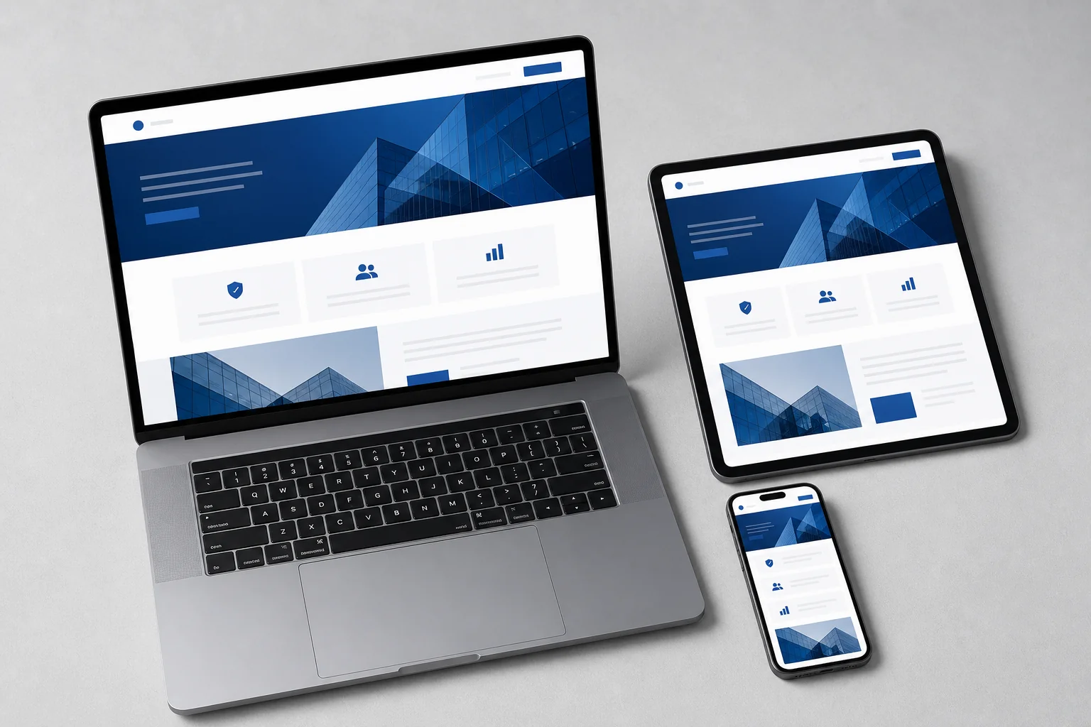
Enterprise buyers are busy. They scan before they read. Your website's visual hierarchy, the size, weight, and positioning of elements, needs to guide their eye to the most important information without requiring effort. Generous whitespace isn't a luxury; it's a functional design decision that makes content easier to process and signals that your brand is confident enough not to cram everything above the fold.
Cluttered layouts are one of the most common trust-killers on B2B startup websites. They signal either a lack of design expertise or a lack of clarity about what the business actually does. Both interpretations are damaging in a procurement context.
Generic stock photography, the kind featuring diverse teams laughing around laptops, has become a credibility liability in European B2B markets. Buyers have seen these images thousands of times, and they've learned to associate them with brands that haven't invested in their own visual identity. Custom photography or a distinctive illustration style signals investment and intentionality.
If custom photography isn't in your budget yet, a well-executed illustration system or a carefully curated set of abstract visuals will outperform generic stock every time. The goal is visual distinctiveness, something that makes your brand recognisable across touchpoints.
A B2B website that breaks on mobile doesn't just create a poor user experience, it signals technical negligence to buyers who are evaluating your startup's ability to deliver digital products. European enterprise buyers increasingly conduct initial vendor research on mobile devices. A responsive, performant mobile experience is table stakes, not a differentiator. For more on building performant web experiences for European audiences, see our guide on PWA development for European markets.
Iconography is where many B2B startups reveal the seams in their visual identity. Mixing icon styles, some outline, some filled, some from different libraries, creates visual noise that signals a lack of design system thinking. For buyers evaluating a software or technology vendor, this is a meaningful signal about how the product itself will be built.
Choose a single icon style and apply it consistently across your website, product UI, and marketing materials. Outline icons tend to feel modern and lightweight; filled icons communicate solidity and clarity; duotone icons can add visual interest but require more careful implementation to avoid looking busy.
The same principle applies to UI components. If your website uses three different button styles, two different card treatments, and inconsistent form element styling, it tells a technical buyer that your team doesn't work from a design system. That's a red flag for enterprise buyers who will be integrating your product into their own workflows. Consistent UI components are a visible proxy for engineering discipline, and they matter more than most startup founders realise.
The imagery you use across your digital channels communicates your startup's positioning as clearly as your copy does. The question isn't just "does this image look good?", it's "what does this image say about who we are and who we serve?"
B2B buyers buy from people, not companies. Human-centred imagery, showing real team members, real work environments, or real customer contexts, builds the kind of relational trust that enterprise procurement requires. Product-centred imagery works well for software interfaces and technical documentation, but it rarely builds emotional connection on its own.
The most effective B2B visual content strategies combine both: human context that establishes trust, and product/interface imagery that demonstrates capability. Neither alone is sufficient.
For B2B startups in data-heavy industries, the visual style of your charts, graphs, and infographics is a brand asset. A distinctive data visualisation style, consistent colour usage, clean typography, clear labelling, signals analytical rigour and attention to detail. It also makes your content more shareable across LinkedIn and industry publications, extending your brand's reach without additional advertising spend.
A startup can have excellent individual brand assets and still fail at brand consistency. The problem usually isn't the quality of the assets, it's the absence of a system for applying them consistently across every channel where buyers encounter the brand.
Consider the typical European B2B buyer's journey: they see a LinkedIn post, visit your website, download a PDF case study, receive a sales email, and review a pitch deck, all before speaking to anyone on your team. If the visual identity shifts meaningfully between any of these touchpoints, the buyer's subconscious registers the inconsistency as a trust signal. Not a catastrophic one, but a cumulative one.
The solution is a brand style guide that's practical enough for non-designers to follow. This doesn't need to be a 200-page brand bible. For most B2B startups, a focused 15-20 page document covering logo usage, colour values, typography, imagery guidelines, and tone of voice is sufficient to maintain consistency across a small team and its agency partners.
Pair the style guide with a template library: a master pitch deck template, an email signature template, a LinkedIn banner template, and a proposal document template. These templates eliminate the most common sources of brand inconsistency without requiring design expertise from every team member. For context on how development and design costs interact with brand system work, our development budget planning guide covers how to allocate resources across design and build phases.
A visual identity that works well in the UK doesn't automatically translate to Germany, the Netherlands, or the Nordic markets. European B2B buyers bring distinct cultural expectations to their vendor evaluations, and a brand that ignores those expectations signals a lack of market understanding.
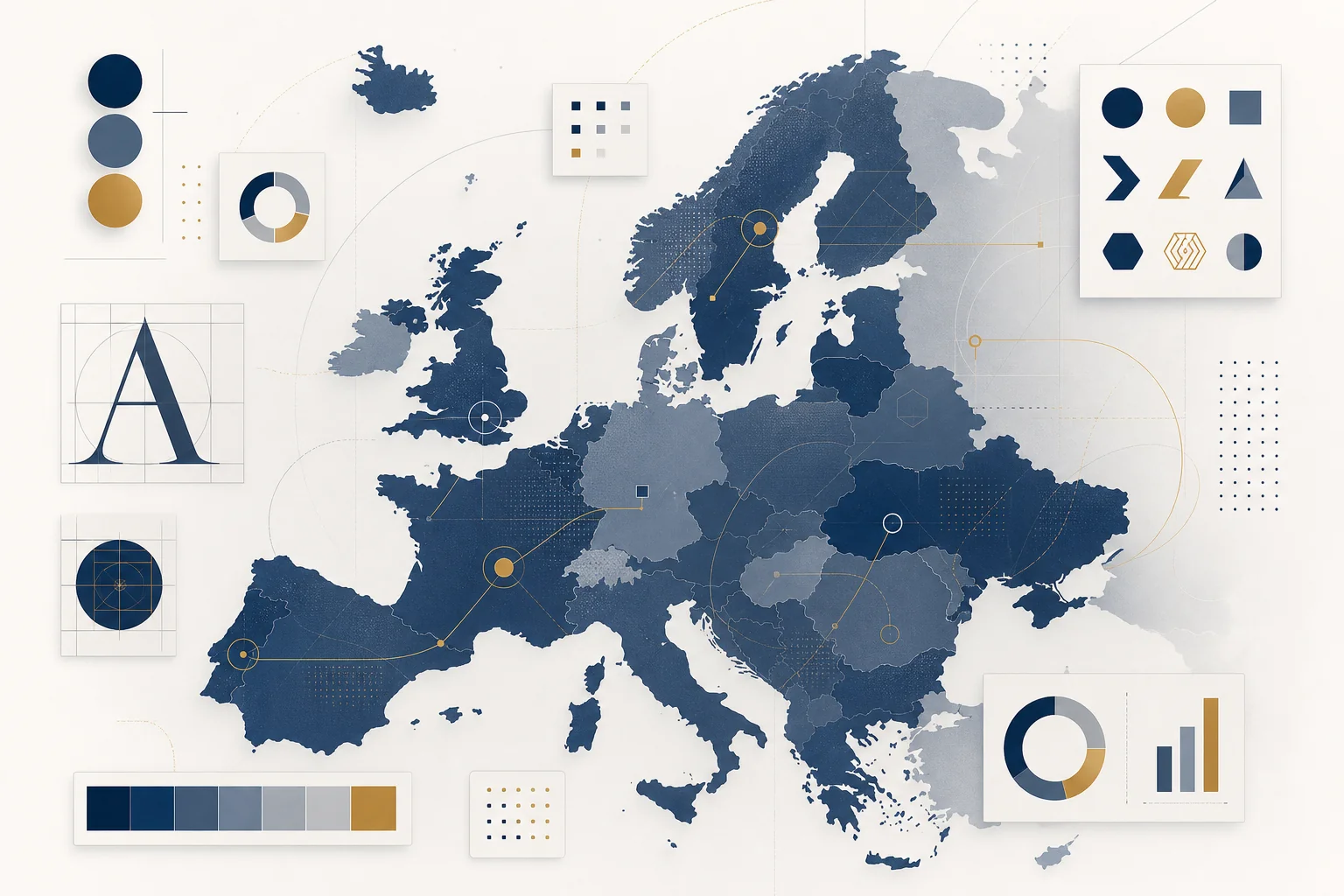
German buyers tend to respond to precision, structure, and technical depth in visual communication. Dense information design, detailed diagrams, structured layouts, comprehensive documentation, reads as competence rather than complexity. UK buyers generally prefer a cleaner, more editorial visual style with stronger emphasis on narrative. Dutch buyers value directness and functional clarity; decorative design elements that don't serve a purpose tend to be viewed with scepticism. Nordic buyers, particularly in Sweden, Finland, and Denmark, have high expectations for minimalist, accessible design that reflects the region's strong design culture.
If you're localising your website or marketing materials into German, Dutch, or Finnish, your design system needs to accommodate text expansion. German text typically runs 30-40% longer than English equivalents. A button that reads "Get Started" in English might need to accommodate "Jetzt loslegen" in German, which requires different button sizing, different line-break handling, and different layout assumptions. Building these considerations into your design system from the start is far cheaper than retrofitting them after launch.
European enterprise buyers, particularly in regulated industries, actively evaluate whether vendor websites demonstrate GDPR awareness through their design. Cookie consent mechanisms, privacy policy placement, and data collection form design all communicate whether your startup understands European regulatory requirements. A poorly implemented cookie banner or a data collection form that doesn't meet GDPR standards signals compliance risk to procurement teams, which can stall or kill deals in regulated sectors.
For startups targeting multiple European markets simultaneously, the question of when to localise versus when to maintain a unified global brand is a strategic one. The answer depends on your sales motion, your target buyer personas, and the cultural distance between your home market and your target markets. As a general rule: localise copy and imagery before you localise visual identity. The former has higher impact at lower cost.

Not every startup can invest in all nine of these decisions simultaneously. The good news is that they're not equally weighted, and the right sequencing can deliver most of the trust-building impact at a fraction of the full investment.
Before you approach your first European buyer, you need three things in place: a scalable logo system, a defined colour palette with accessibility-compliant contrast ratios, and a website that demonstrates responsive, performant design. These three decisions account for the majority of the first-impression trust signal that procurement teams evaluate.
Typography and basic brand voice guidelines can be established at the same time without significant additional investment. Together, these five elements constitute a minimum viable brand identity for a B2B startup entering European markets.
Once you have initial traction, paying customers, active pipeline, or a funded growth phase, invest in the remaining four decisions: iconography and UI component consistency, a defined imagery strategy, a full brand style guide with templates, and market-specific localisation for your primary European targets.
This phased approach lets you allocate budget where it has the most immediate impact, while building toward a complete brand system that can support enterprise sales at scale. Working with a digital agency that understands both design and development, rather than treating them as separate workstreams, typically produces better results and lower total cost. You can see examples of how this integrated approach works in practice at Axire Infotech's project portfolio.
For B2B startups targeting European enterprise buyers, the agency vs. freelancer decision for brand identity work follows a similar logic to the same decision for product development. A freelance designer can produce excellent individual assets. An agency with integrated design and development capability can produce a brand system that works consistently across your website, product UI, and marketing channels, because the same team is responsible for all three. For a detailed breakdown of this decision, our guide on choosing between a freelancer and agency for your first digital product covers the key trade-offs for European founders.
Axire Infotech's UI/UX design service is built specifically for B2B startups and SMBs targeting European markets, combining brand identity work with the technical implementation expertise to ensure your visual identity performs as well as it looks. Our web development team works in parallel with design to ensure every brand decision translates correctly into your live digital presence.
Brand identity costs vary significantly based on scope. A focused engagement covering logo system, colour palette, typography, and basic brand guidelines typically ranges from a few thousand to tens of thousands of pounds, depending on the agency's experience and the complexity of your requirements. For a detailed view of how design costs interact with development budgets, see our website cost breakdown for 2026. Contact Axire Infotech directly for a scoped estimate based on your specific requirements.
A focused brand identity engagement, covering the Phase 1 essentials described above, typically takes four to eight weeks from brief to final deliverables. A full brand system including style guide, template library, and localisation for multiple European markets can take three to four months. The timeline depends heavily on how quickly your team can provide feedback and make decisions at key review stages.
This is one of the most common questions B2B founders ask, and the honest answer is: it depends on your sales motion. If you're selling to enterprise buyers who evaluate vendors through formal procurement processes, a credible visual identity is a prerequisite for getting into those processes. If you're selling to early adopters through founder-led sales, you can iterate on brand identity alongside product development. The minimum viable brand identity described in Phase 1 above is sufficient for most pre-PMF B2B startups.
Brand strategy defines what your brand stands for, your positioning, your values, your target audience, and the promise you make to buyers. Brand identity is the visual and verbal expression of that strategy. The nine decisions in this guide are all brand identity decisions, but they should be grounded in a clear brand strategy. Investing in visual identity without a defined strategy often produces beautiful assets that don't communicate a coherent message to buyers.
In most cases, no. A well-designed visual identity system should be flexible enough to work across European markets with localisation at the copy and imagery level, rather than requiring a full visual identity redesign for each market. The exceptions are startups entering markets with very distinct cultural expectations, such as Germany, where the visual communication norms in B2B contexts differ meaningfully from UK or Dutch norms. In those cases, market-specific adaptations within a unified brand system are usually the right approach.
Every week that your visual identity underperforms, it's quietly costing you deals. Procurement teams in the UK, Netherlands, Germany, and across Europe are making trust judgements about your startup based on signals you may not even be aware of. The nine decisions in this guide give you a clear framework for addressing those signals systematically, starting with the highest-impact decisions and building toward a complete brand system that supports enterprise sales at scale.
Axire Infotech works with B2B startups and growing businesses across Europe to build visual identities that perform as hard as the products they represent. From brand identity and UI/UX design through to full-stack web and mobile development, our integrated approach ensures your brand is consistent, credible, and conversion-ready across every digital touchpoint.
Explore our full range of digital services, or get in touch with our team to discuss your brand identity requirements. If you're also evaluating your broader digital presence, our agency comparison guide for European businesses and our red flags guide for choosing a development agency are useful next reads. You can also browse our full article library for more guides on building a credible digital presence in European markets.
Let's discuss your project and create something amazing together.